Juelle Web Design

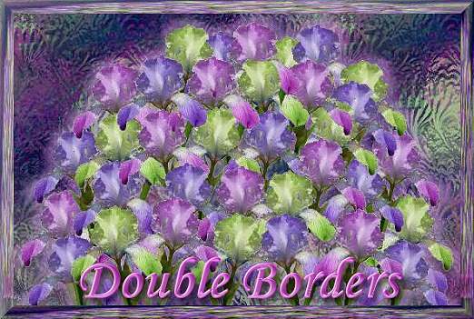
Here we are doing fancy double borders with a matching title graphic and buttons.
I made the stained glass backgrounds on the title graphic and the buttons with Photo Impact - I tried to make it look like carnival glass,
To make the main background I used the same stained glass but put it over a pale green background and brought the transparency to the point that it looked more green than carnival glass.
The borders and divider I made from a photo of the blue iris that grows in my yard. I cut it out and made a gif and then I colorized two of them to the chartreuse and the pinkish color. I also used them in the main graphic and the buttons.
DeZignz by DeWitch ©2004
"Site best viewed with 1024 x768 screen resolution"
![]()


